Candle Light Concert Poster-LightUp
久石 讓—燭光音樂會海報
Scope
Poster Design
Typography
Prints
Lead Designer
Tool Used
Adobe Illustrator, Photoshop

Project Goals
Objectives
- To visually interpret the fusion of music, ambiance, and emotion through poster design.
- To explore six conceptual methodologies in visual communication.
- To develop multiple typographic solutions that reflect the interplay between light, music, and feeling.
Methodological Framework
The design approach was guided by the exploration of the following methodologies:
- Expository: Clarifying the concert's purpose and experience.
- Biomorphic: Exploring natural, organic forms inspired by candlelight and string music.
- Representational: Using recognizable imagery related to ice, flame, and musical motifs.
- Sympathetical: Evoking mood and emotion aligned with Hisaishi’s music.
- Ambiguous: Introducing elements open to interpretation.
- Antithetical: Contrasting visual ideas—like ice vs flame, stillness vs motion.
Hybrid Explorations & Finals
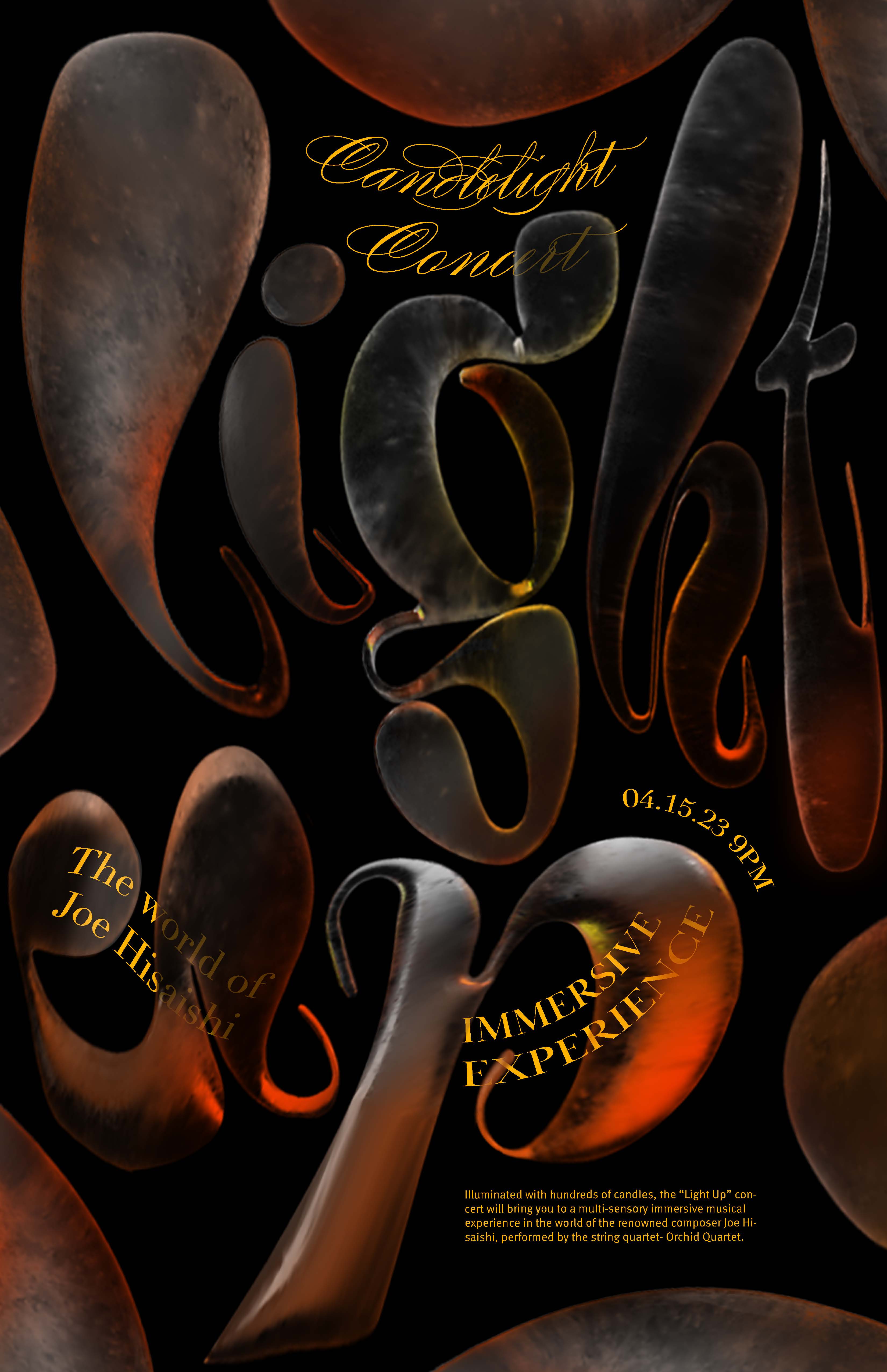
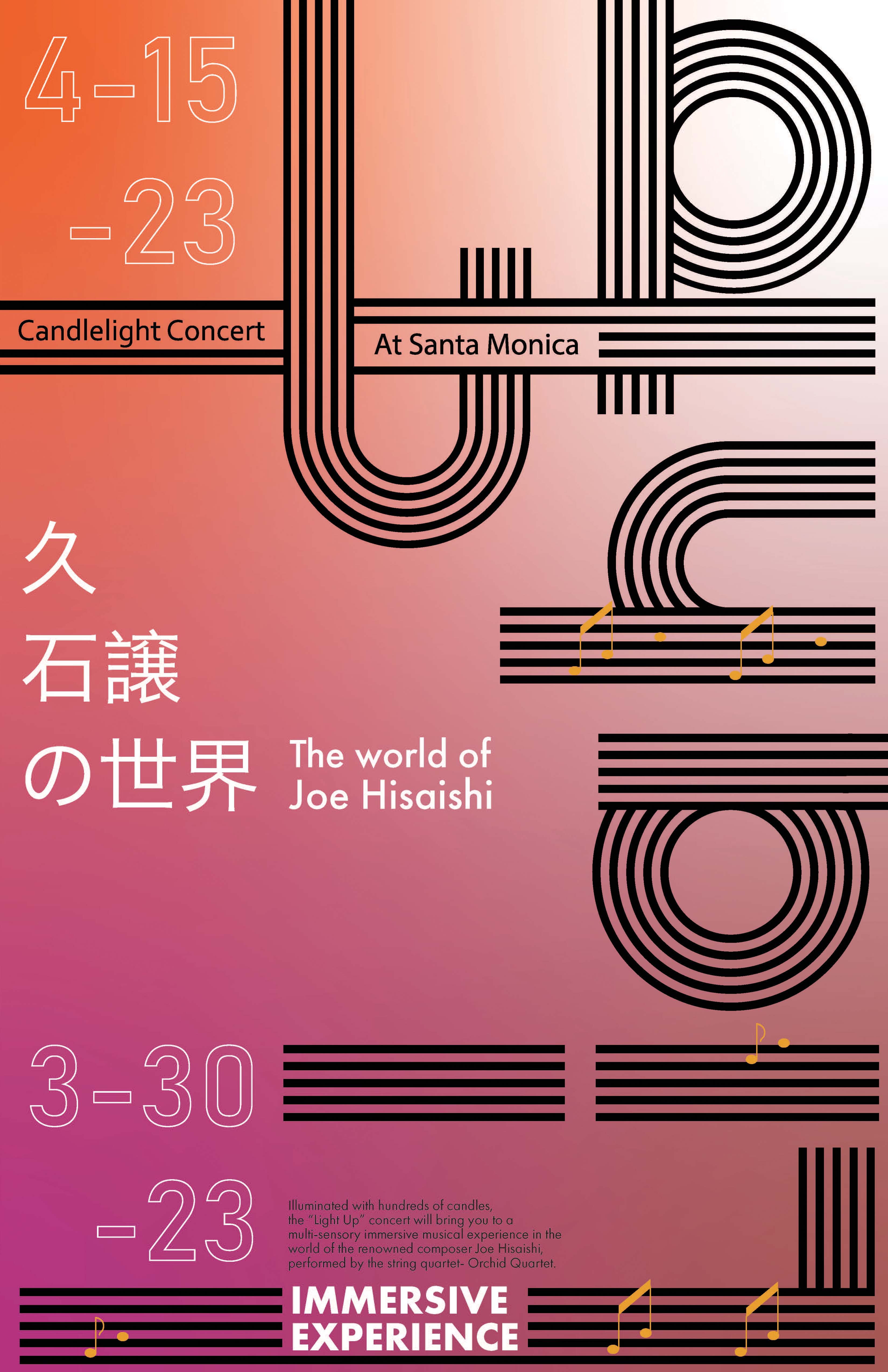

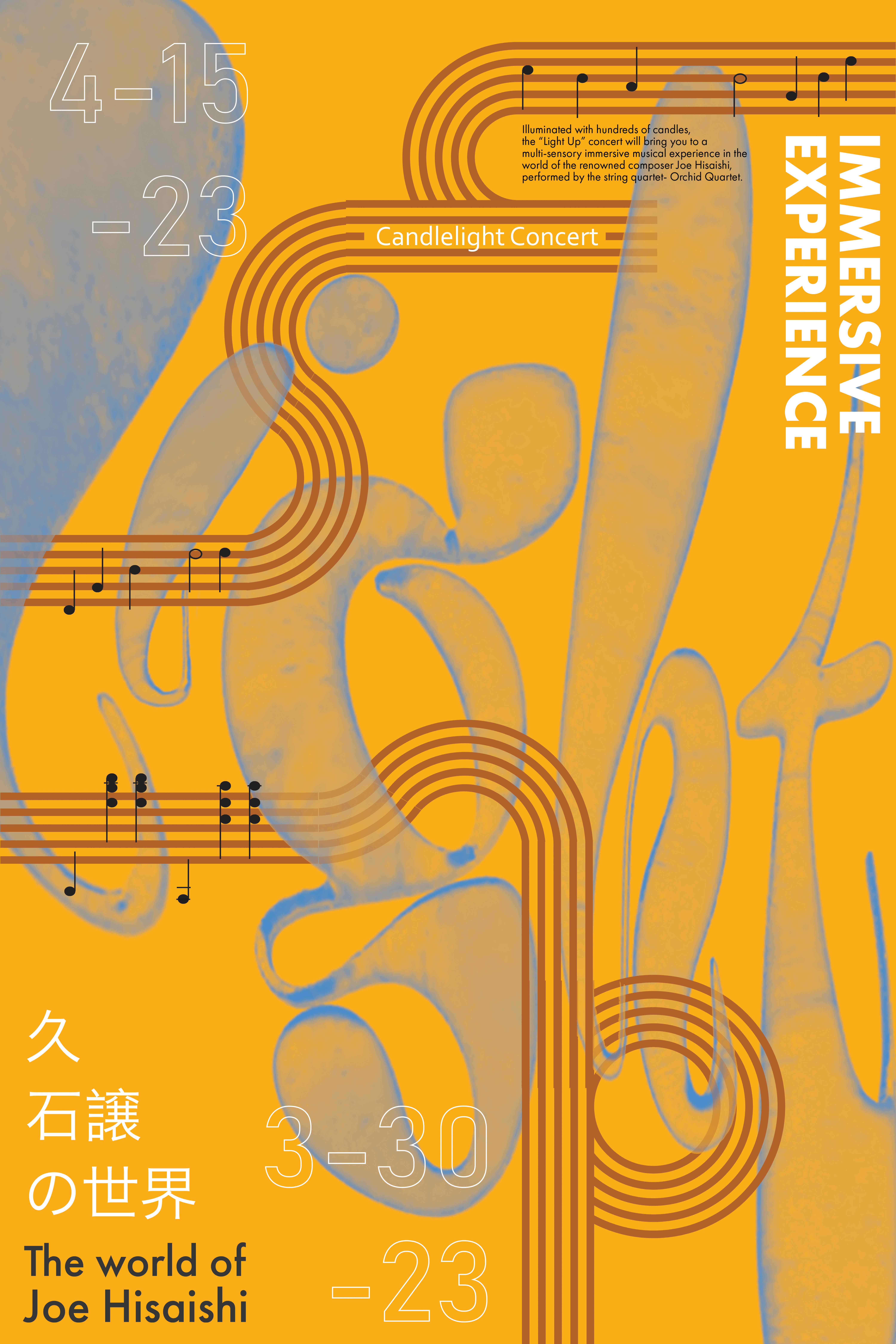
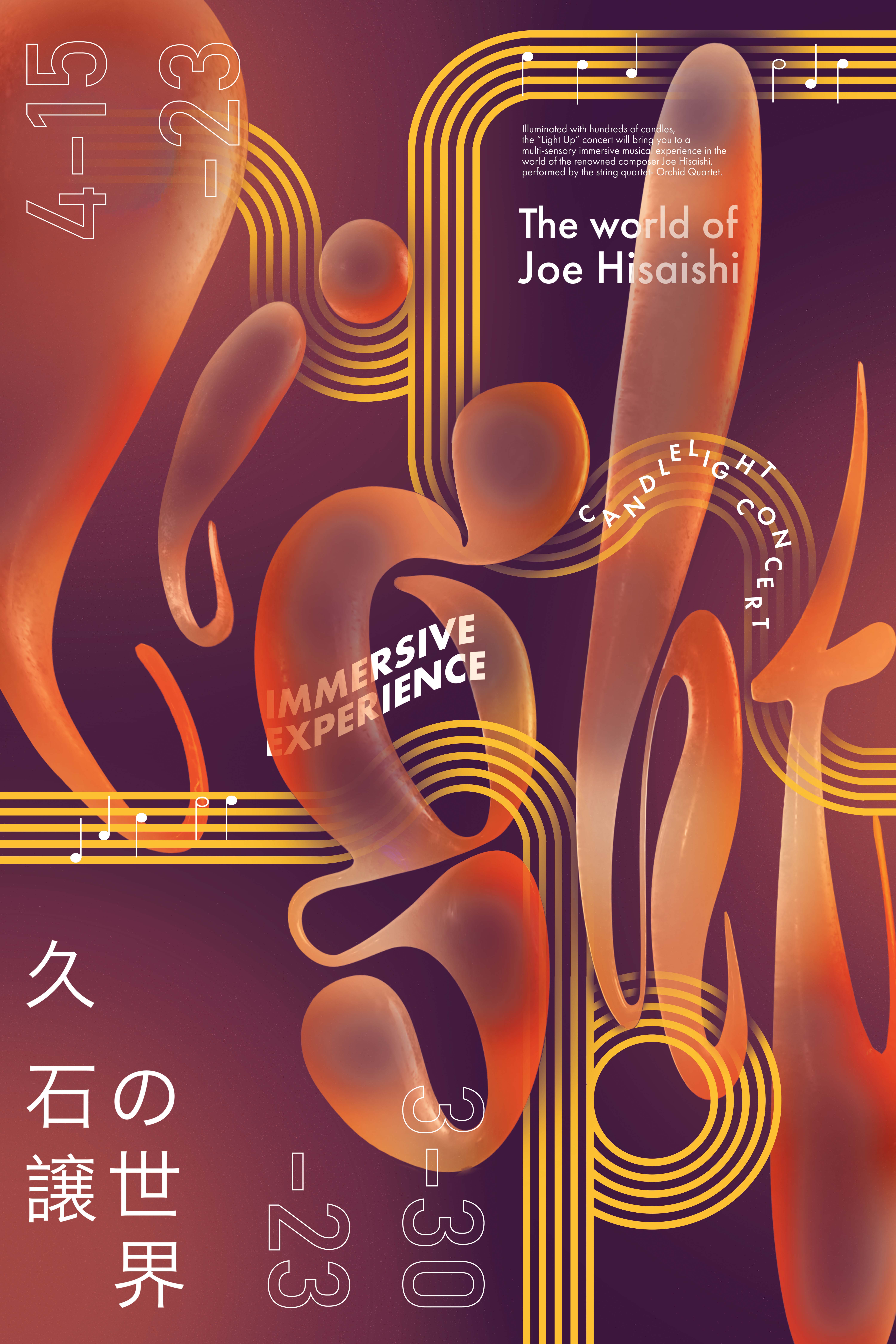
Design Elements
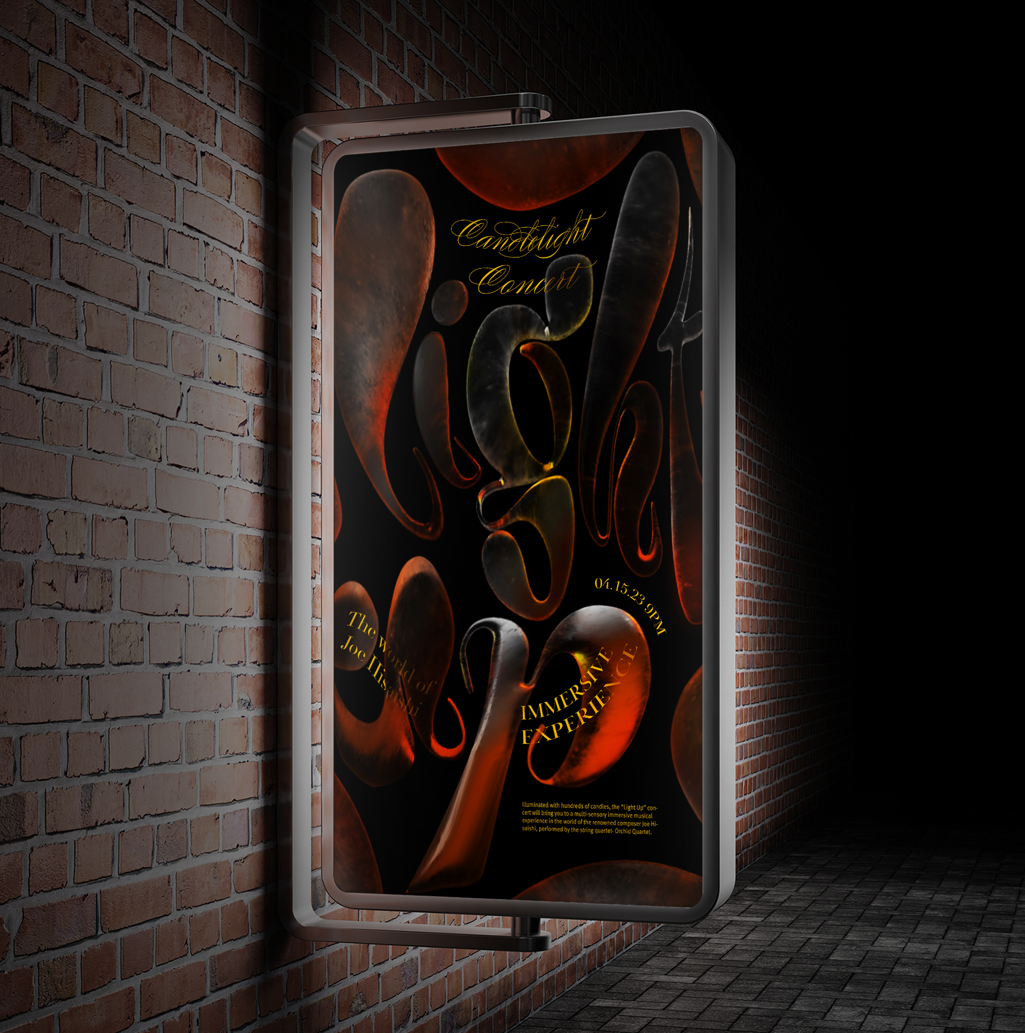
Color palette: Anchored in deep blacks contrasted with warm hues of orange and red, capturing the soft illumination of candlelight.
Textures: The interplay of delicate ice and expressive flame represents how the concert's atmosphere and music gently dissolve barriers and resonate emotionally.
Typography: Custom-designed letterforms that fuse natural movement, musical rhythm, and elemental expression.
Final Outcome
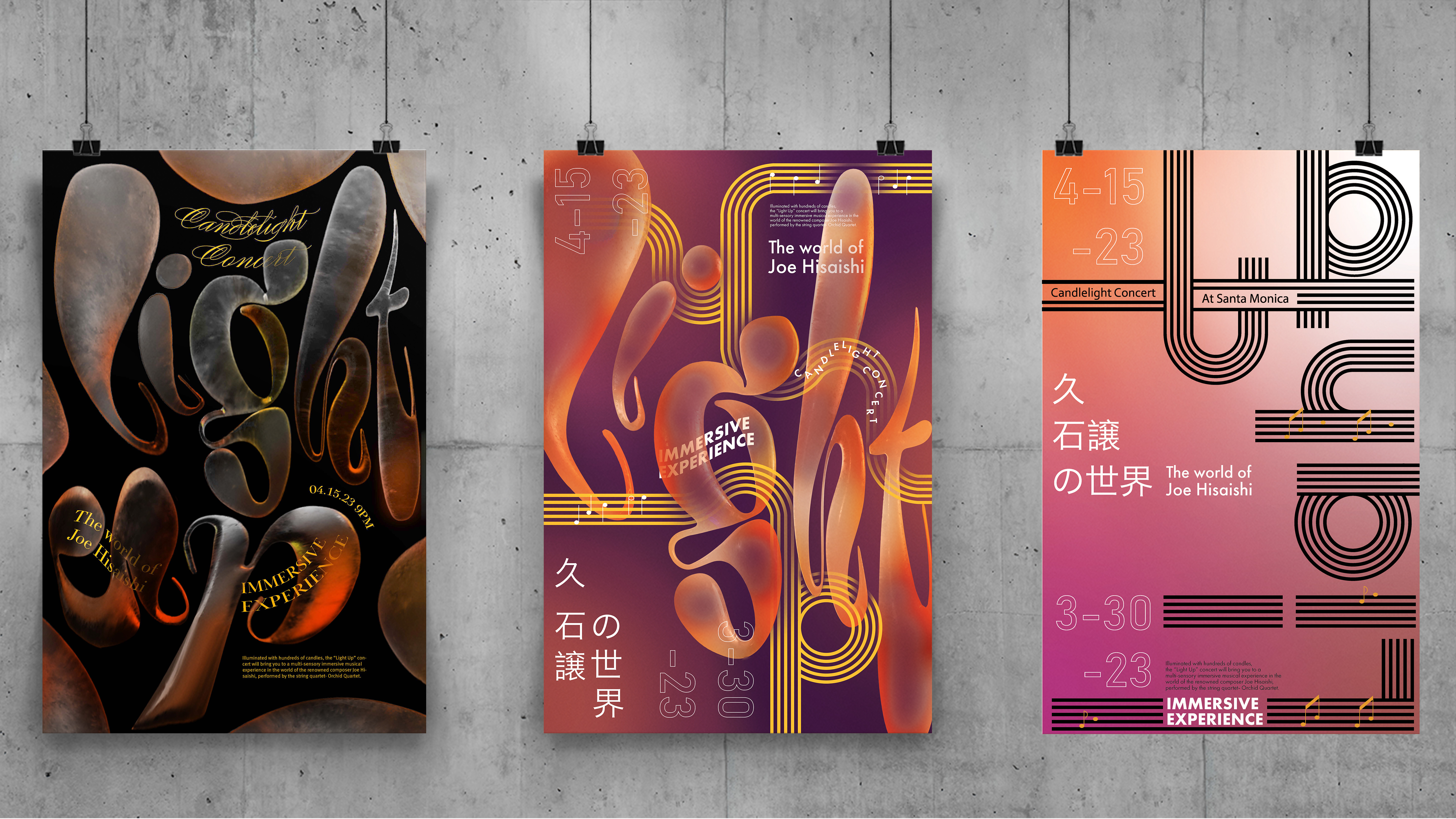
The three final poster concepts each offer a unique yet harmonious interpretation of Light Up. Together, they visually express the essence of Hisaishi’s music, the intimate glow of candlelight, and the emotional journey evoked through sound and atmosphere.
