
alDip & ALMOND:
Packaging Design Case Study
朱古力品牌包裝設計
Scope
Packaging
Illustration
Lead Designer
Tool Used
Adobe Illustrator, Photoshop
Project Overview
ALMOND: A fun, flavor-forward almond chocolate under H-E-B’s Hill Country Fare brand, designed for broad snacking appeal.
Brand Structure
| Tier |
|---|
| Brand |
|---|
Brand Logo
| Product Name |
|---|
| Market Positioning |
|---|
Price Range
| Premium |
| H-E-B |
 |
| alDip |
| Ethical, globally sourced, artisanal |
High
| Mainstream |
| Hill Country Fare |
 |
| ALMOND |
| Everyday favorite, affordable indulgence |
Low
Premium teir: H.E.B

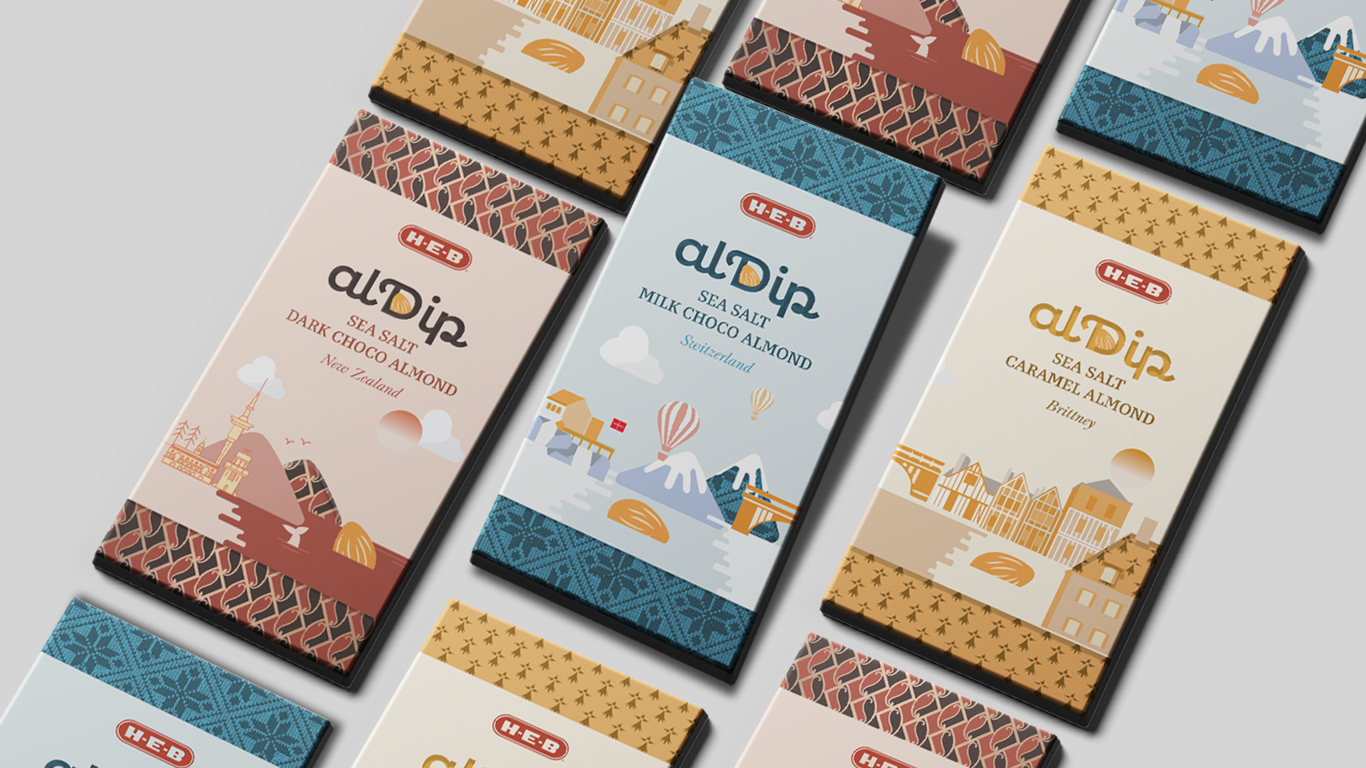
Product Concept: alDip
alDip is a Sea Salt Almond Chocolate made with cocoa sourced from boutique farms across New Zealand, Brittany, and Switzerland. This chocolate tells a story of authenticity, craft, and place—with a deep connection to its origins.Packaging Design Goals
-
Elevate the product as a High-tier chocolate
-
Hinting sourcing origins through pattern and illustration
- Evoke a sophisticated, worldly tone consistent with H-E-B's premium standards
Design Features
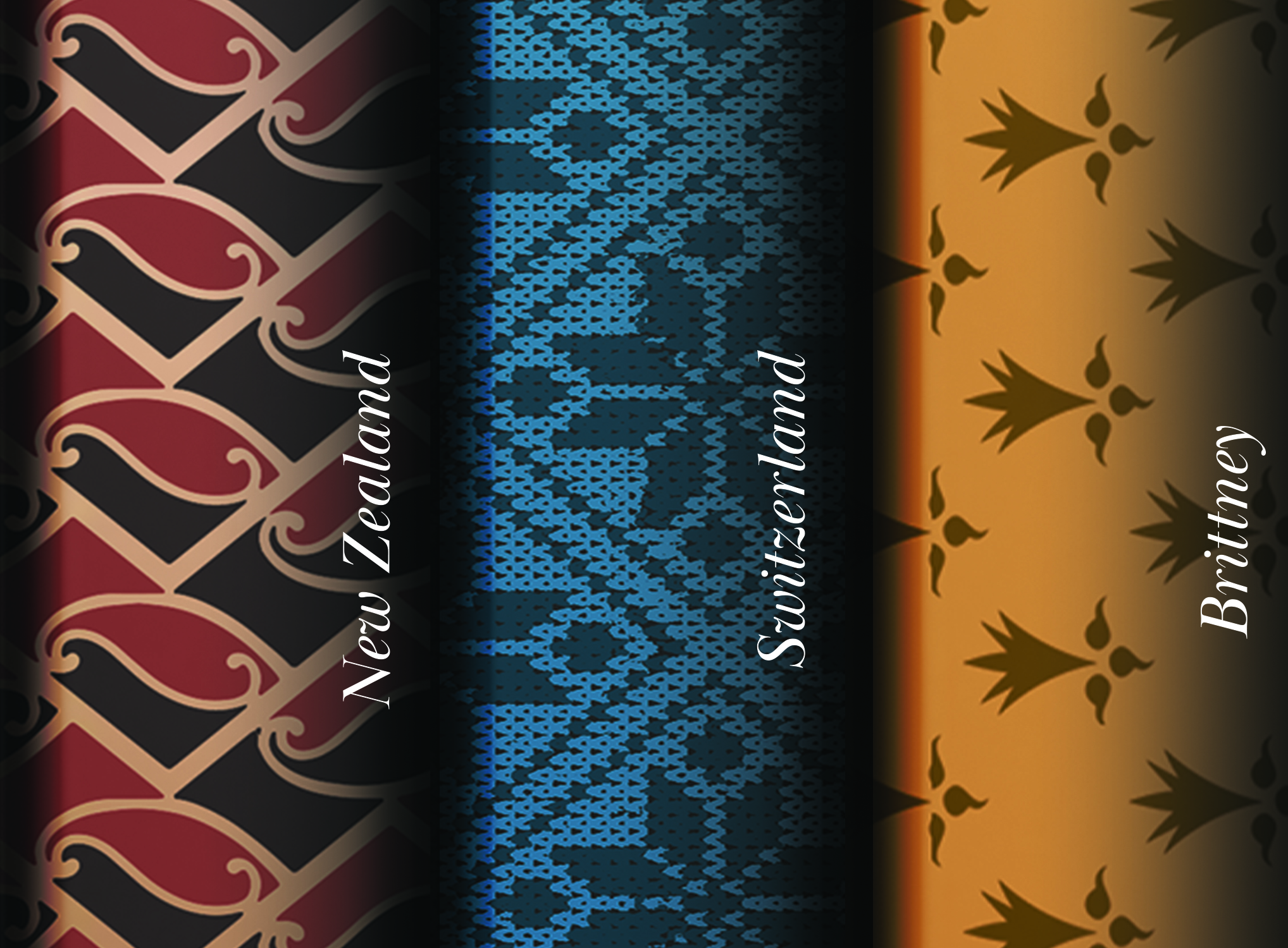
Pattern-Driven Wrappers: Each wrapper features a pattern representing the chocolate’s country of origin.Color Palette & Materials
-
Matte paper with textured finishes
- Elegant color themes :Burgundy, Blue, Orange
Illustrated Inserts with Cutouts
Outside of the wrapper, each bar includes an illustrated inserts featuring scenic coastlines views from:
- New Zealand
- Brittany
- Switzerland
These cards are designed with cutouts that frame and reveal the wrapper’s underlying pattern, blending the place and product into one unified story.
Outcome


Product Concept: ALMOND
ALMOND is a cheerful, flavor-forward chocolate for casual snacking. It’s approachable, colorful, and designed for broad retail appeal.
Design Features
For the ALMOND line, the design emphasizes vibrancy, flavor clarity, and accessibility. The goal was to create a visually bold, flavor-driven package that stands out on shelves and appeals to everyday chocolate lovers.
Flavor Variants
︎Dark Choco – Deep brown
︎Milk Choco – Dark blue
︎Caramel Choco – Rich purple
Each uses a splash of liquid almond chocolate imagery on the front to represent the flavor—flowing around a central almond visual for appetite appeal.
Typography & Color Use
Bold sans-serif fonts are used throughout to establish a modern, friendly tone. The word “ALMOND” appears in bright orange, creating strong contrast against each background color and unifying the series visually.Packaging Format
Delivered in resealable zipper bags for on-the-go convenience and freshness. Glossy finish with light texture for better grip and a premium everyday feel.Outcome
